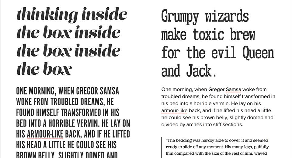
“Thinking Inside the Box Inside the Box Inside the Box” !
Designing with Style Guides
Mason Wendell
Mason Wendell

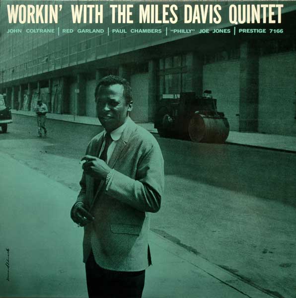
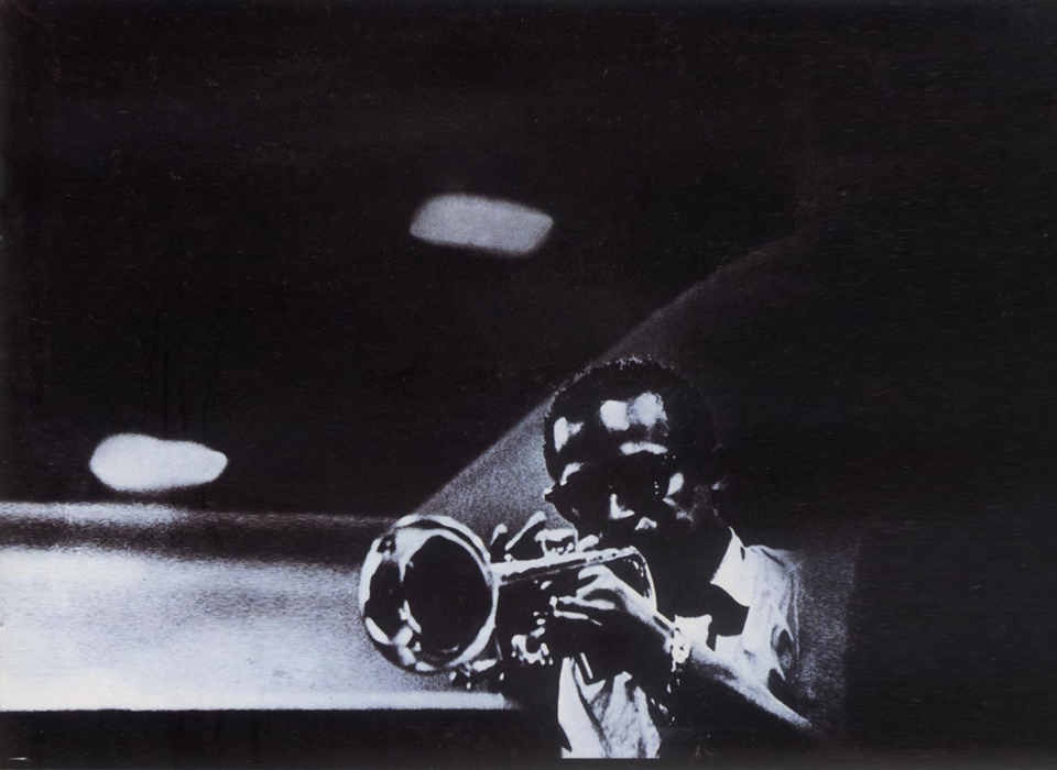
Reid Miles & Blue Note
SVG, CSS Blend Modes
Bugs? Let me know on github.
CSS
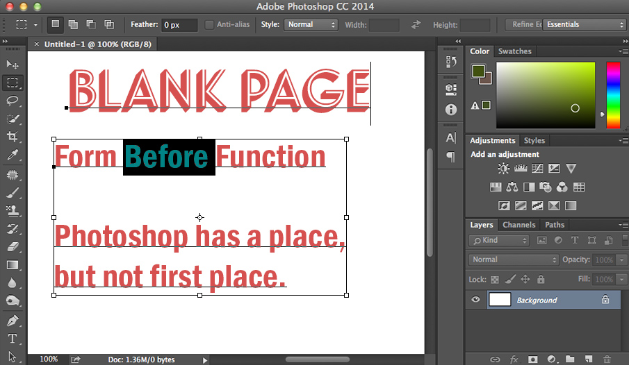
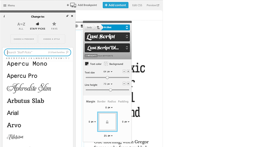
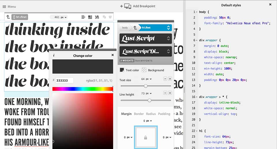
Know your medium
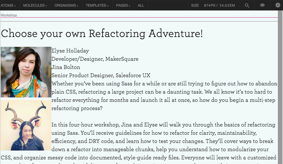
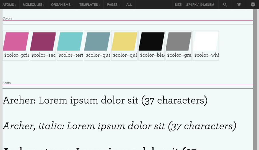
Present in the Browser
| Music | Design | Connection |
|---|---|---|
| Melody and Lyrics | Content | What You Hum In The Shower |
| Music | Design | Connection |
|---|---|---|
| Melody and Lyrics | Content | What You Hum In The Shower |
| Harmony And Rhythm | Design Components | Give Structure And Distinction To The Content |
| Music | Design | Connection |
|---|---|---|
| Melody And Lyrics | Content | What You Hum In The Shower |
| Harmony And Rhythm | Design Components | Give Structure And Distinction To The Content |
| Instruments Players | Art Direction | Aesthetic Framework And Limitatons |
$ms-ratio: $fourth;
$ms-base: 16px 44px;
$ms-ratio: $minor-third;
$ms-base: 16px 44px;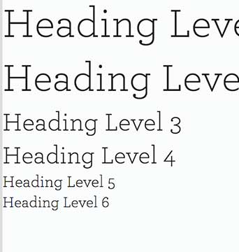
$ms-ratio: $golden;
$ms-base: 16px 44px;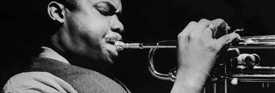
Unity
$palettes: (
  blue: (
    base: rgb(28, 117, 188),
    light: rgb(0, 160, 223),
    dark: rgb(0, 52, 121)
  ),
  red: (
    base: rgb(243, 6, 23),
    dark: rgb(99, 50, 63)
  ),
  green: (
    base: rgb(90, 135, 57),
    light: rgb(133, 187, 61)
  ),
  purple: (
    base: rgb(92, 49, 131)
  ),
  orange: (
    base: rgb(203, 113, 19),
    light: rgb(225, 173, 64)
  ),
  yellow: (
    base: rgb(231, 230, 47)
  ),
  gray: (
    base: rgb(130, 130, 130),
    light: rgb(219, 219, 219),
    x-light: rgb(242, 242, 242),
    xx-light: rgb(250, 250, 250),
    dark: rgb(78, 80, 84)
  ),
  white: (
    base: #FFFFFF,
    transparent: hsla(0, 0%, 100%, 0),
    semitrans: hsla(0, 0%, 100%, 0.15)
  ),
  black: (
    base: #000000
  )
);
/* Get color function */
@function color($color, $tone: 'base') {
  @return map-get(map-get($palettes, $color), $tone);
}

/* Using color function */
.button {
  color: color(white);
  background-color: color(blue, light);
}
$palettes: (
  blue: (
    base: rgb(28, 117, 188),
    light: rgb(0, 160, 223),
    dark: rgb(0, 52, 121)
  ),
  red: (
    base: rgb(243, 6, 23),
    dark: rgb(99, 50, 63)
  ),
  green: (
    base: rgb(90, 135, 57),
    light: rgb(133, 187, 61)
  ),
  purple: (
    base: rgb(92, 49, 131)
  ),
  orange: (
    base: rgb(203, 113, 19),
    light: rgb(225, 173, 64)
  ),
  yellow: (
    base: rgb(231, 230, 47)
  ),
  gray: (
    base: rgb(130, 130, 130),
    light: rgb(219, 219, 219),
    x-light: rgb(242, 242, 242),
    xx-light: rgb(250, 250, 250),
    dark: rgb(78, 80, 84)
  ),
  white: (
    base: #FFFFFF,
    transparent: hsla(0, 0%, 100%, 0),
    semitrans: hsla(0, 0%, 100%, 0.15)
  ),
  black: (
    base: #000000
  )
);
/* Get color function */
@function color($color, $tone: 'base') {
  @return map-get(map-get($palettes, $color), $tone);
}

/* Try colors mixin */
@mixin try-colors() {
  @each $palette, $items in $palettes {
    @each $name, $value in $items {
      /* color: #{$value}; */
      /* background-color: #{$value}; */
    }
  }
}

/* Using color function */
.button {
  color: color(white);
  background-color: color(blue, light);
  @include try-colors();
}
github.com/at-import/try
Use the CSS, JS, and other assets from your styleguide in production.
Also use Grunt to automate tasks like Sass compiling and Modernizr builds.